UX Research & Design, Product Management, Creative Direction
The goal was to build an iOS app for recommending books. This short video shows an overview of how the app was designed and implemented (music is stock, sounds are mine.)
Objective
I was hired to take the team from the rough idea “An app for recommending and talking about books” to reality. Over the course of 18 months, we went from white boards to successful submission to the app store. Also, I successfully trained a project manager to take the project over after I departed on to my next venture.
Challenges
1.Context - Offline vs Online, Real Time vs Not
Usually book clubs meet offline, and allow for social interactions to occur in real time. We were designing an app to replace those social interactions with a digital experience. Meeting in real life has its pros and cons, but allowing the “human interaction” to be replaced by an app was a hard nut to crack.
2. Creating a new Visual Language
We needed a “killer feature” to bring people into the app and keep them there. The founders thought that a “recommendation engine” could both make it easier to recommend books and provide valuable data that could be monetized down the road. So my challenge was to create a visual language that would be the core of the recommendation engine – it had to be fun, easy, and fast.
3. Branding
The initial branding, including the name and logo, did not resonate with users and made it difficult for them to understand the product.
Process
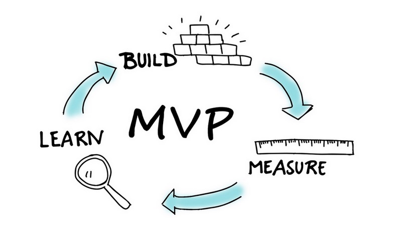
1. Define MVP
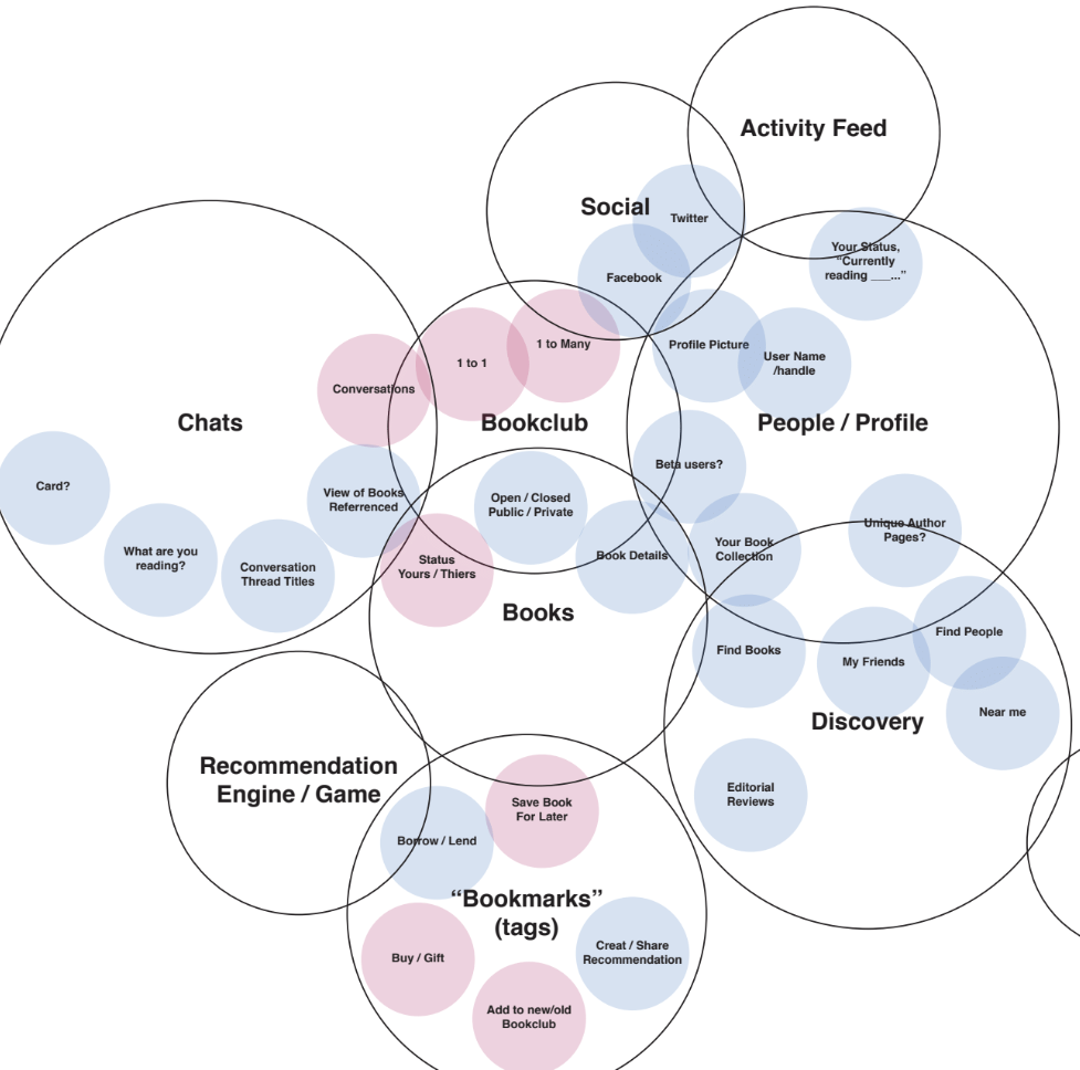
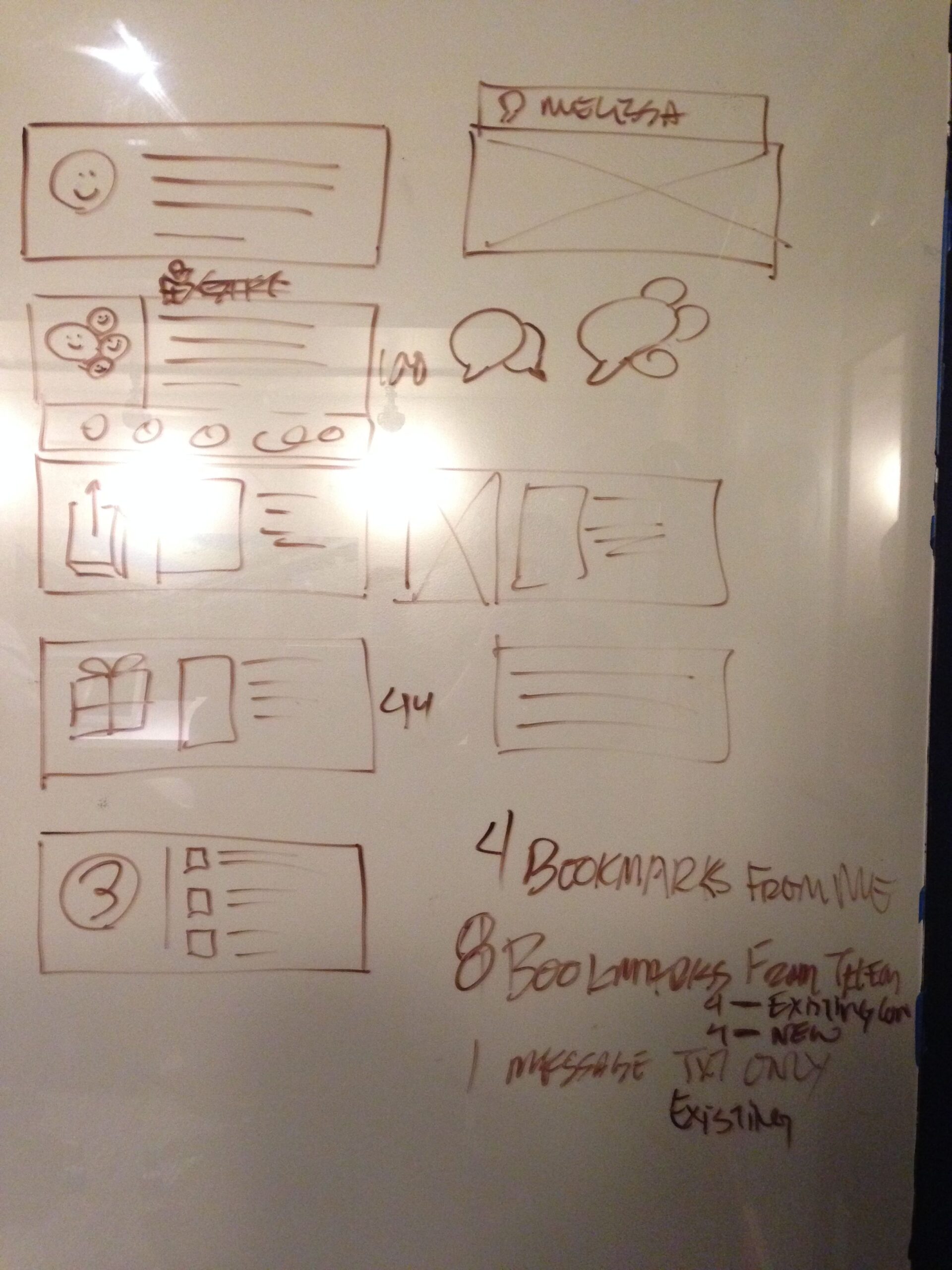
When I joined the team, we didn’t have an a minimum viable product defined. The broad strokes were there, but the “killer feature” didn’t exist. Additionally, we didn’t really know what version 1.0 should be. So we did what any team would, created mind maps and hit the white boards hard.
We decided the killer feature would be visual tiles to make recommending books faster and easier. This feature (thought of in a dream by one of the founders, Elizabeth DiMarco) was brilliant because a.) it was fun for users and gamified the experience b.) made the data we were collecting homogenous and therefore more valuable to the business.
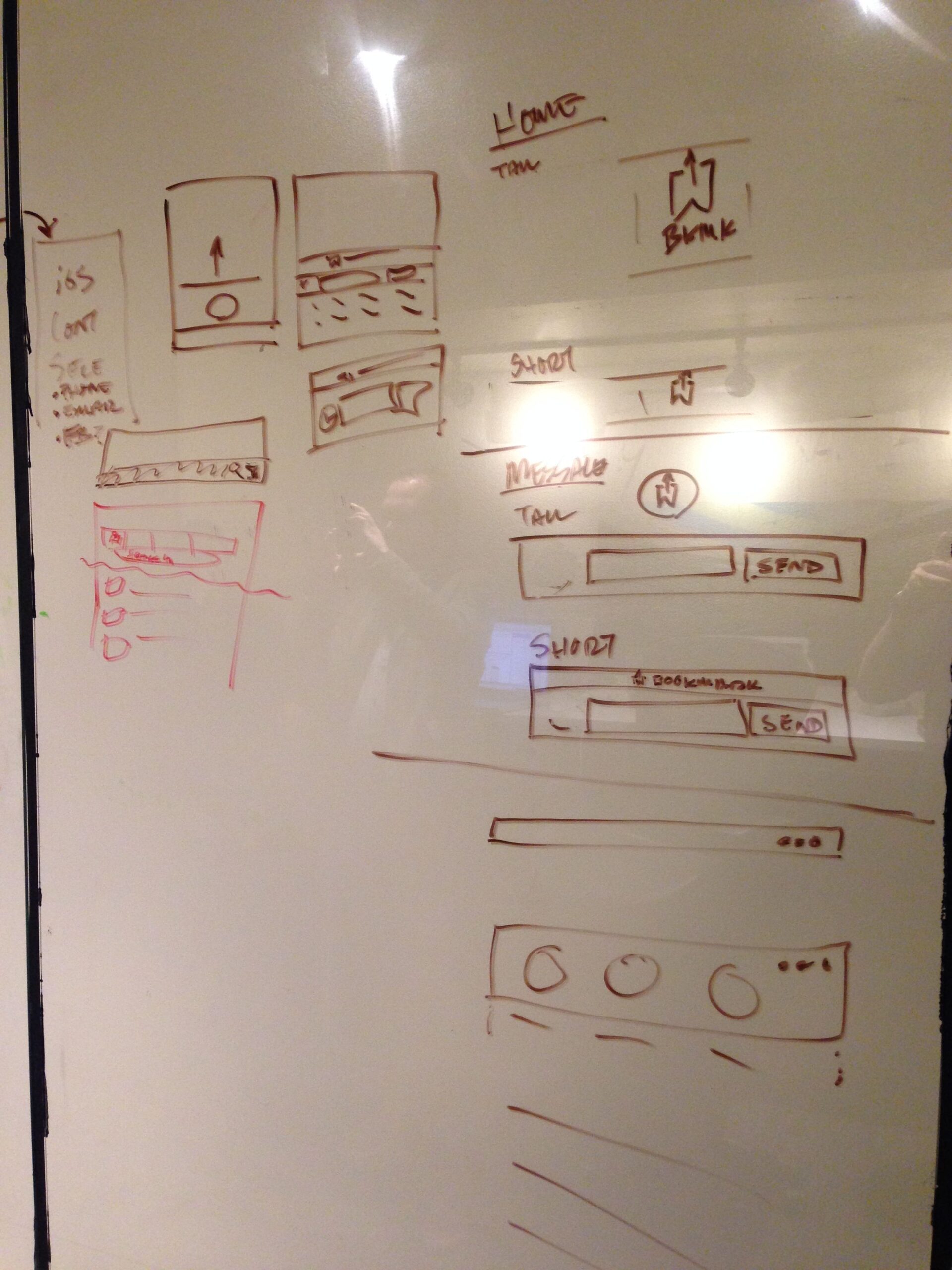
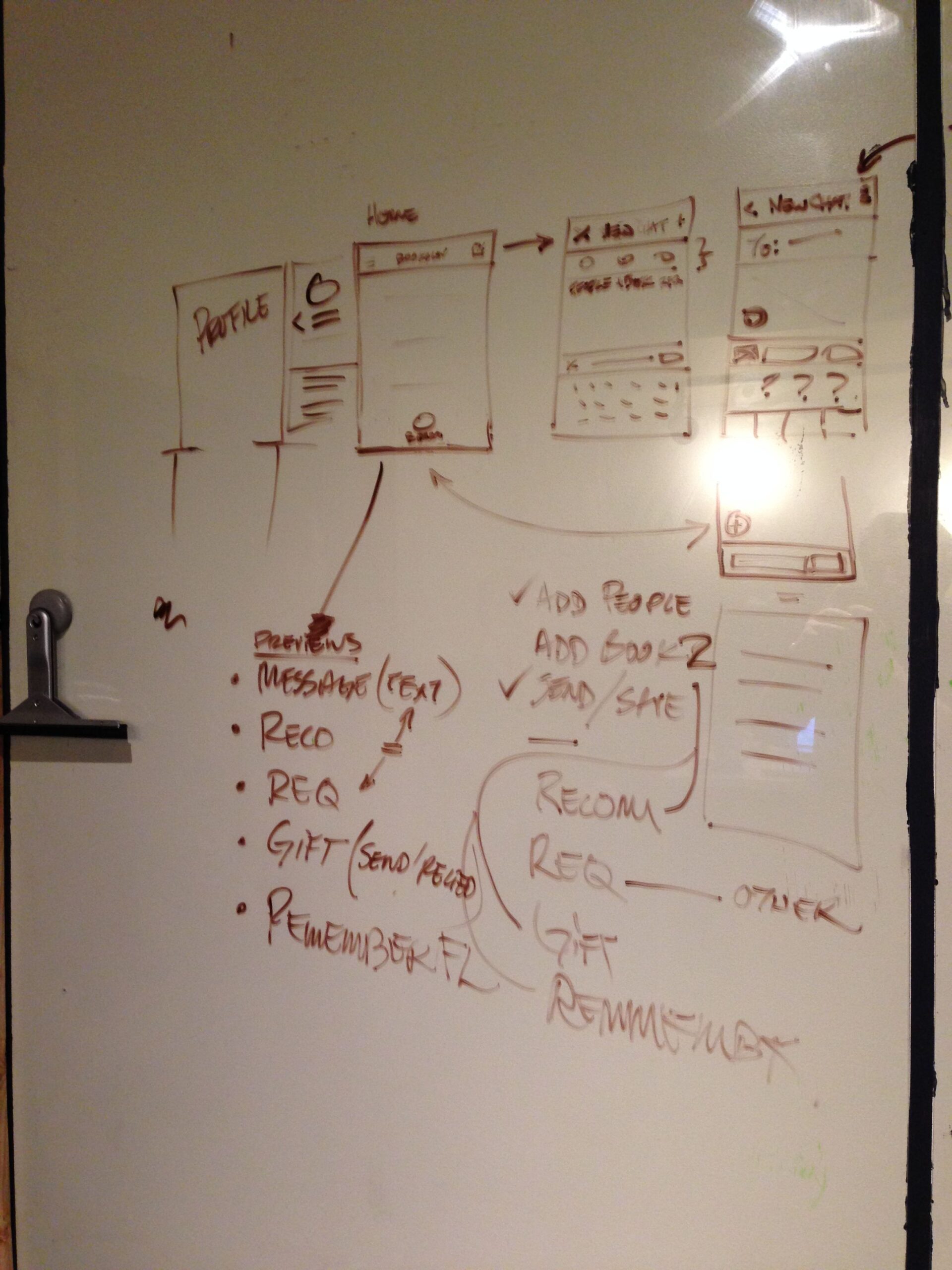
We started at the white board
Slide 2 Heading
Lorem ipsum dolor sit amet consectetur adipiscing elit dolor
Click Here
Slide 3 Heading
Lorem ipsum dolor sit amet consectetur adipiscing elit dolor
Click Here
Slide Heading
Lorem ipsum dolor sit amet, consectetur adipiscing elit. Ut elit tellus, luctus nec ullamcorper mattis, pulvinar dapibus leo.
Click Here
Slide Heading
Lorem ipsum dolor sit amet, consectetur adipiscing elit. Ut elit tellus, luctus nec ullamcorper mattis, pulvinar dapibus leo.
Click Here
Previous
Next
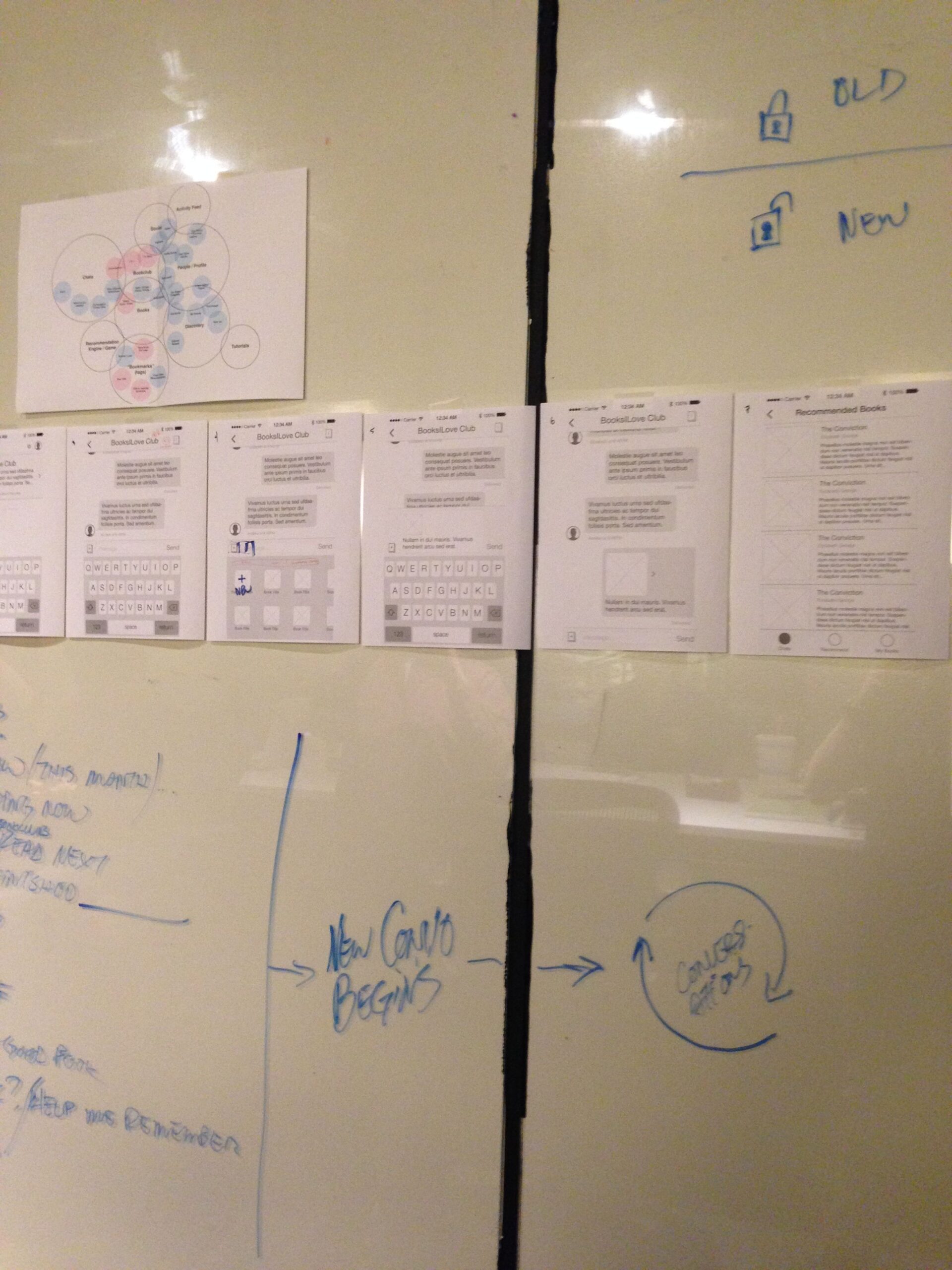
2. Refine the MVP concept / Create a Visual Language
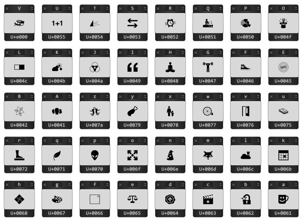
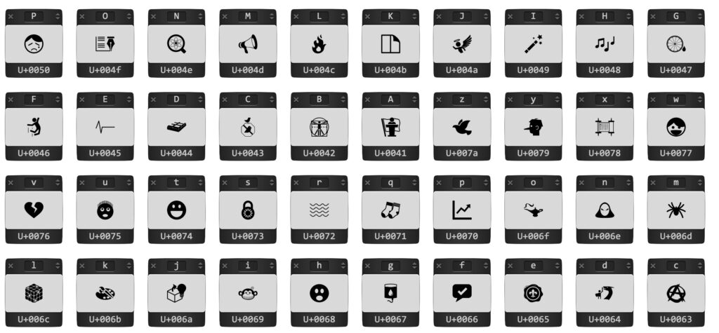
This was in many ways, the real heart of the Books I Love app. What could be quicker than trying to find the right words? Emojis! I hired a designer, Luke Vink, to illustrate the tiles.
Here are the tiles. You’ll notice they have a letter above each picture – that’s because the developers decided to make implement this design system as a font. This proved to be a cool way to implement this concept while keeping the loading time and memory down.
Before any coding began, I needed to do some user testing with people who were in the target market, but I had exhausted everyone I knew personally. So, I hit the the super markets in Bellevue… and fished for testers. Sure enough lots of people gave me the time of day, and were willing to complete my “tappable prototype” on my phone. I also gave the test URL and questions to the other members of the team, and got even more feedback.
To do a proper test, it’s important not to ask any leading questions. In a nutshell, we asked people to complete the basic funnels without any help. I instructed my team on how to do this as well and even wrote them a script. The goal was to NOT help users who might get stuck, but rather to just tell them to pretend they were alone and see if they could figure it out for themselves. After a little internal iteration, our design was at a point where most users were able to create an account, complete a book recommendation, and send it to their “simulated” friend.
4. Refine the look and feel using data
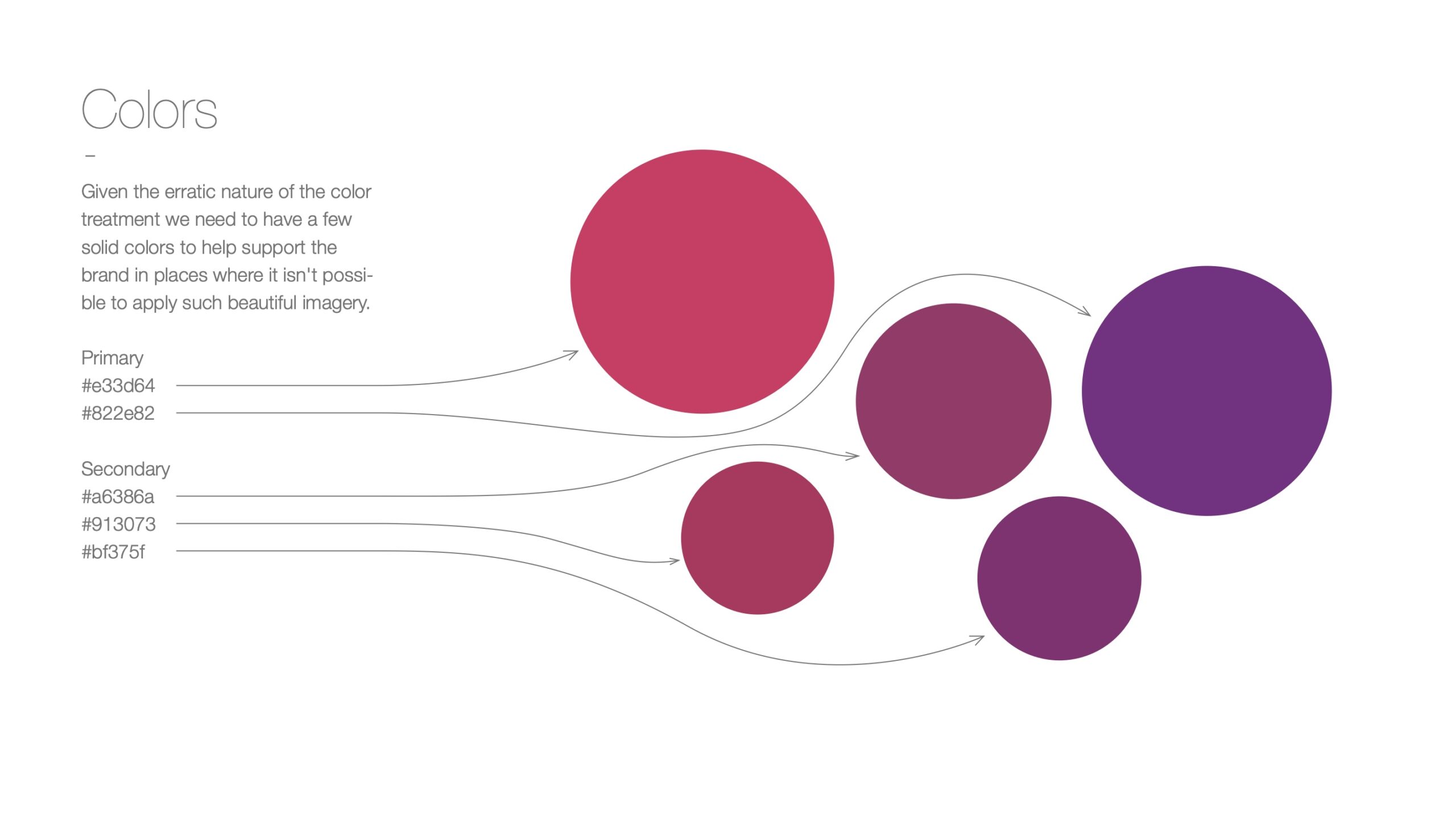
Initially the founders wanted to be everything the way they liked it personally, which was quite specific. Sometimes that works out! However, in this case our logo looked like clip art, and the colors they chose were the primary colors – red, yellow and blue. People mentioned that they were not digging the look and feel, and using this data I led the team in a pivot towards something useable. Here’s the color palette we ended up with.
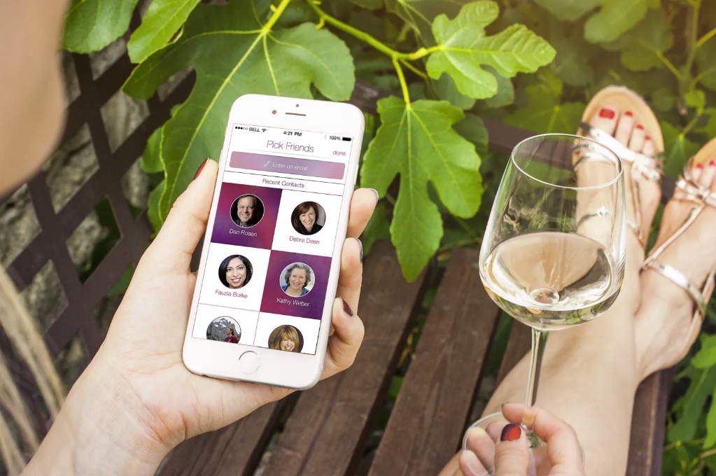
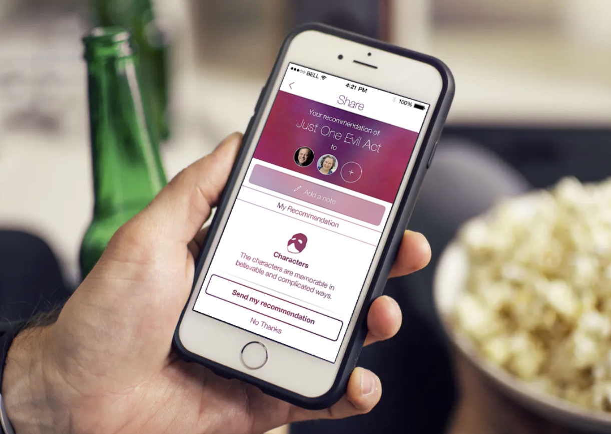
Rather than show what the early screens looked like, I’ll spare you and show some final images after we hired the team at Ratio Interactive to take a pass at the new palette.
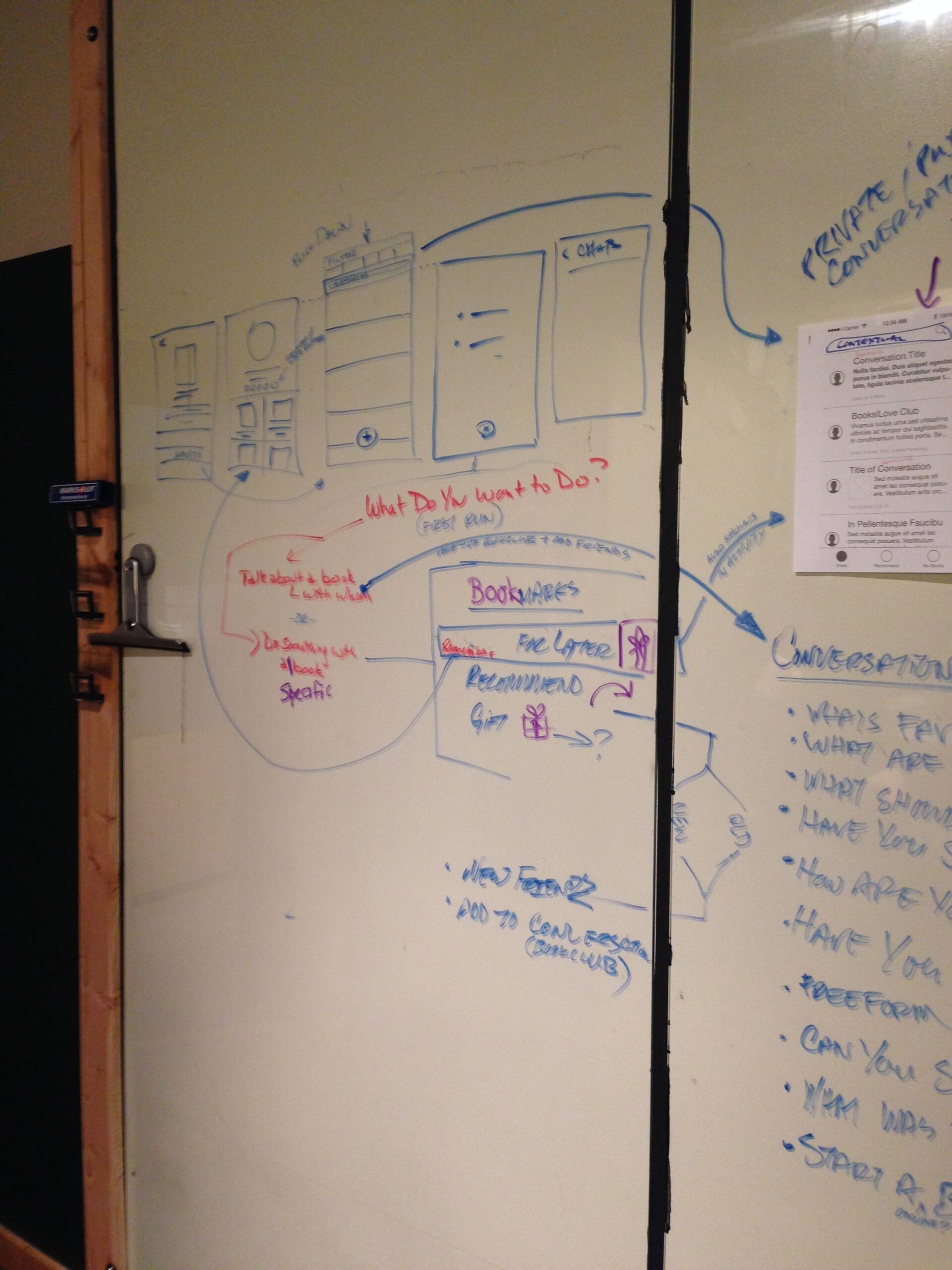
These images are from the final part of the funnel where users share their recommendation with someone who is a contact in their phone.
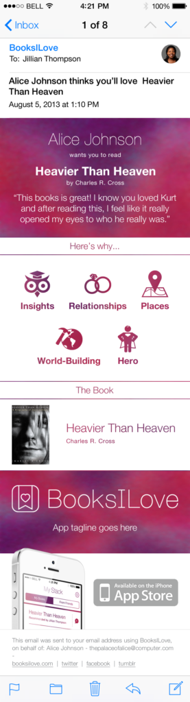
5. Complete the Loop
The last stage of this funnel was actually outside of the app itself. This doesn’t however make it any less important than the UX inside the app, as a new user’s first impression of the experience was usually receiving a book recommendation from a friend. Here’s what that looked like, mocked up for a mobile view.
6. Submission to App Store
Surprisingly, this was quite easy. Despite my not being a programmer, this fell on me. All things considered it was the easier part of the process.
Lessons Learned
Validate assumptions! The lean startup methodology is very practical – all information is good if we ask the right questions. When we don’t want to see what’s in front of us, we only have ourselves to blame. The unfortunate truth from my perspective was this: we as a team didn’t ask the right questions of our users before we began designing a product.
The answer to one simple question “Do you want to an app to replace your book club”was never something we as a team wanted to hear. And so, we made an app that was beautiful, spent a bunch of money, employed a bunch of people, and made a product that ultimately people didn’t really need. So it goes.
