Since I believe great design speaks for itself, I recommend starting by navigating through the clickable prototype I made for the developers in Figma (best viewed on desktop).
I took the Kingli.io app UI from concept to deliverable in 9 months. It was an agile process that involved a high degree of ambiguity and shifting priorities. I collaborated across a team that included developers, graphic designers, and early investors who were already using the platform. My work touched every phase of the design process from initial concepts on whiteboard to the clickable prototype which was delivered to the engineering team and is in development now.
The Challenge
1. People don't understand / trust Crypto Currency
The crypto currency space is ripe with confusion (to put it lightly.) In order to make any project understandable to people, it has to be transparent and simple.
2. It is hard to actually buy / sell / transact.
Most wallet apps involve an immense number of steps to get going. Nothing like “venmo” exists in the Crypto space.
3. Mining is hard to understand
Since the people who make the algorythms which power crypto currencies are often financial experts or software developers, the average user is often left in the dust. I knew it was essential for a transparent window into the mining process to be accessible to all sorts of users.
Process
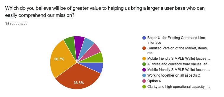
Step 1 - Talk to Existing Users
Since there were existing users of this currency doing their transactions in a command line, I decided to send out a survey and see what I got back. So, I asked the existing users of the platform to fill out a survey delivered via google forms. This information helped validate that we were going in the correct direction to move away from a command line interface that worked best on desktop and was hard to use, and move towards a simple mobile interface that would be more accessible.
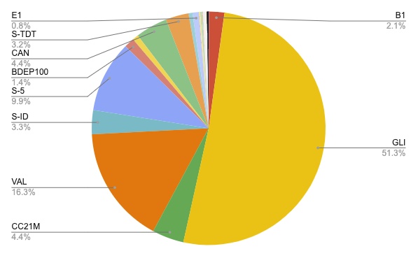
Step 2 - Generate Analytics
Looking at the existing data of how the Kingli platform was being used already was incredibly helpful. I asked the programmer for a dump of all transactions, then visualized it using google charts. I discovered that there were many items that weren’t commonly being used, so I made a case to only focus on allowing users to transact only using the most commonly used Items (Gli and Val) in the app.
Initially this request failed and I was asked to design an app that allowed users to transact an almost infinite number of virtual items per the main stakeholder’s request. As you can imagine this was still quite complex! However after designing it, we collectively saw that we needed to simplify and I was indeed correctly interpreting the data in the first place about what users actually were using the platform for. This confirmation allowed me to get buy-in from stakeholders on moving forward with a simple design for a wallet that only used the 2 essential items GLI (currency) and VAL (how the currency is mined).
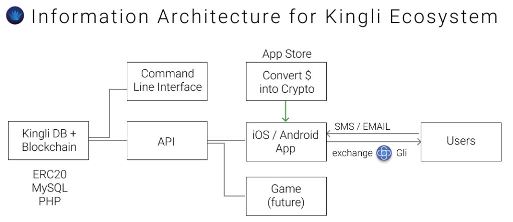
Step 3 - Map Data Flows
Since there were quite a few products in planning that were interacting with the Kingli platform (backend architecture), I decided to map out the various entities in the ecosystem. This was helpful not only to my own thinking, but also helped me make sure I was on board with the rest of the team. A big question had been where users actually convert traditional dollars into crypto currency, and in this model I proposed we use the app store to achieve this.
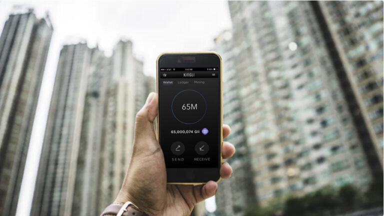
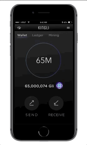
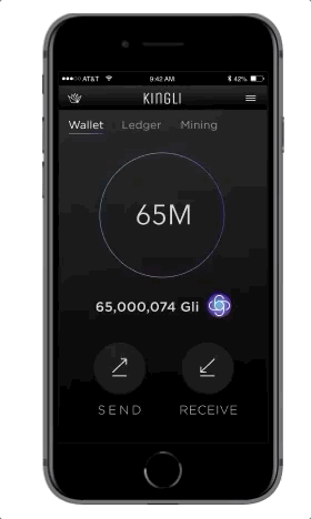
Deliverable #1 HomeScreen
After extensively studying the “status quo” of mobile crypto-currency wallets, I was able to convince the stakeholders that we need 3 main screens. Due to the simplistic nature of this app and keeping with modern app design trends I choose to not have any bottom bar, and focus the main navigation at the top.
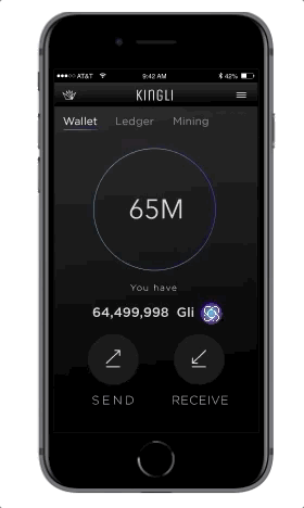
1. The “Wallet” screen is where users initiate transfers outgoing or incoming, and see their balance.
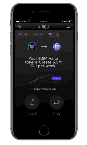
2. “The Ledger” screen is a history of all transactions. Important for building trust.
3. “The mining screen” is super important for showing the user how new currency is created from Mining. This screen is a key educational component, drives our first KPI.
Deliverable #2 Sending Money
The user presses send to initiate the transfer.
The user chooses the amount of money to send.
As a bonus the user can see the value of their transaction in GLI or traditional currency (USD).
The user then selects a recipient from their contacts.
A congratulations screen is essential to make the user feel like they’ve achieved their goal, and confirm the transaction.
Though not shown here, when a user receives a SMS / email with a request to send funds and they haven’t yet downloaded the APP, they are prompted to download, which is a major way new users enter the Kingli ecosystem.
Deliverable #3 Buying Currency
When I joined the Kingli team, the concept of buying currency was taken for granted. A user sends Bitcoin to an existing member, and that member sells them GLI. WHAT?
This simply wouldn’t do.
To create an easier process and adhere to my objective of making cryptocurrency easier to understand for the user, I choose to create a user flow that allows integration with the app store.
To make it easy for users to obtain GLI, they would simply have their credit card already integrated with the app store, and choose how much they would like to spend. SIMPLE.
Deliverable #4 Mining made simple
Problem:
Mining is a challenging concept to wrap one’s head around.
Solution:
The technical explanation is that buying VAL (mining tokens) generates GLI at a rate of one per week. It is visualized here via GIF. Once users own a large amount of VAL, they can literally watch their GLI (the tradable currency) increase in front of their eyes!